Bobar: A Retro Display Font That Pops on Modern Websites
Last week, I was refreshing the hero section of a boutique online store—a small but vibrant shop selling handmade ceramics and vintage-inspired home goods. The client loved mid-century aesthetics, warm tones, and tactile textures—but the current headline font felt safe, almost forgettable. So I dropped Bobar into the design mockup as a test. Instantly, the page shifted: not louder, exactly—but *more intentional*. That’s the quiet power of a well-chosen display font.
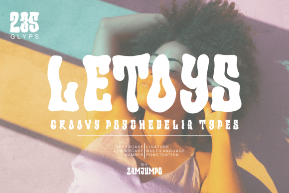
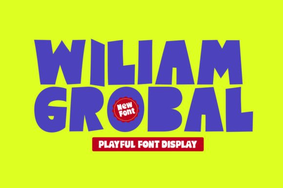
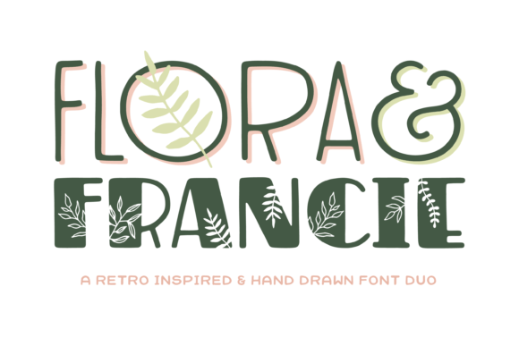
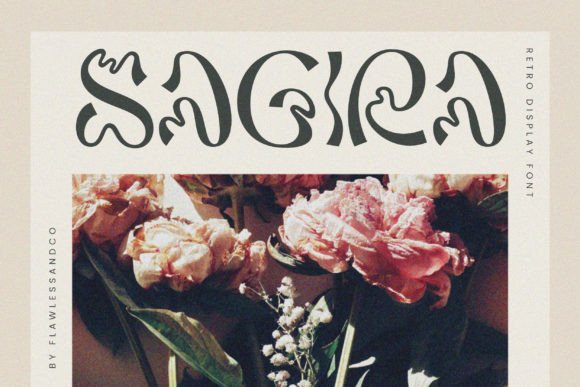
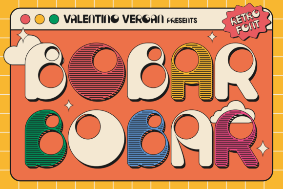
Bobar is a retro-inspired variable font with bold, chunky letterforms and playful, groovy curves. It doesn’t whisper—it leans in with confidence. Think late-60s album covers meets early-2000s web banners, refined for today’s screens. Its personality is friendly but never childish, nostalgic but not dated. As a display font, it’s built for impact—not body copy—and that distinction matters when you’re shaping how users first experience your site.
In practice, I used Bobar for the main headline (“Handmade Ceramics, Curated With Care”) and the subhead (“Shop Small • Ship Thoughtfully”). On desktop, it anchored the layout beautifully over a soft-focus image of a sunlit studio shelf. On mobile, I scaled it down slightly and tightened tracking—still legible, still expressive. No blurring, no rendering hiccups. The variable version made fine-tuning effortless: I adjusted weight and width to match spacing needs without swapping files or loading extra fonts.
Where does Bobar shine? Hero sections, yes—but also product landing pages where tone and trust need to land in under three seconds. It works especially well for creative portfolios (a photographer using Bobar for project titles over full-bleed images), coaching websites (bold session headers like “Your First Breakthrough Starts Here”), and course sales pages (short, punchy benefit-driven headlines). I wouldn’t use it for navigation labels or paragraph text—but that’s not its job. It’s a spotlight, not the stage lights.
Readability is where many retro fonts stumble—especially at smaller sizes or on low-contrast backgrounds. Bobar avoids that trap. Its generous x-height and open counters keep letters clear even at 28px on mobile. Over dark backgrounds? It holds up. Over light image overlays? Still legible—just add subtle text shadow or a soft background tint for contrast. For buttons, I reserved Bobar for primary CTAs only (“Get Early Access”, “Join the Workshop”) and kept secondary actions in a clean sans serif. That visual hierarchy guides attention without shouting.
Font pairing is where Bobar really sings. I paired it with Inter for body copy—neutral, highly readable, and free via Google Fonts. The contrast between Bobar’s expressive energy and Inter’s calm rhythm created balance, not tension. For a more editorial feel—say, on a blog redesign—I’d pair it with a warm, humanist serif like IBM Plex Serif. The key is contrast with cohesion: one voice for emotion, another for clarity.
Before deploying Bobar in production, I checked what came in the package: standalone static fonts (Light through Black) plus the full variable font file (WOFF2 optimized for web). No surprises—no missing diacritics, no gaps in Latin-1 support. It handles English, Spanish, French, German, and Portuguese comfortably. For a digital brand kit or campaign landing page targeting multilingual audiences, that coverage matters. And yes—I verified the commercial license covers web embedding, SaaS dashboards, and client projects. No last-minute licensing panic before launch.
One thing I appreciated: Bobar doesn’t try to be everything. It’s not a system font. It’s not meant for data tables or dense documentation. But where it *is* meant—to headline a new collection, introduce a limited-edition drop, or give personality to a “Meet the Maker” section—it delivers with charm and consistency. That consistency builds recognition. When users see Bobar on the homepage, then again on the email banner, then again on an Instagram story graphic, it quietly reinforces brand identity—not through repetition alone, but through shared mood and intention.
I also tested Bobar in a few unexpected places: as logo text for a podcast about analog creativity (it worked surprisingly well at 48px, especially with tight kerning), and inside SVG icons for a dashboard sidebar (converted to outlines, so no webfont dependency). It held up—proving its versatility beyond pure typography use cases. Just remember: if you’re using it for small UI elements like tags or badges, stick to larger weights and avoid ultra-thin variants. Clarity always wins.
Performance-wise, the WOFF2 variable file clocks in under 65KB—lighter than many static font families combined. With modern @font-face declarations and font-display: swap, it loads gracefully. No invisible text, no layout shifts. That’s critical for both UX and Core Web Vitals. For fast-loading visual content—like a product landing page with animated scroll triggers—Bobar adds personality without dragging things down.
If you're choosing a display font for your next digital project, ask yourself: does it reflect the feeling you want users to carry away? Not just “what does it look like,” but “how does it make the experience *feel*?” Bobar feels warm, human, and confidently nostalgic—without leaning too hard on trend. It’s the kind of typeface that makes people pause, smile, and read on. And in a world of infinite scroll and shrinking attention, that pause is worth more than pixels.
Whether you're designing a portfolio homepage, refining a course sales page, or building a digital brand kit for a small business, Bobar gives you a distinct voice—without sacrificing usability. It’s not just retro. It’s *resonant*. And in digital design, resonance is what turns visitors into readers, readers into customers, and customers into advocates.