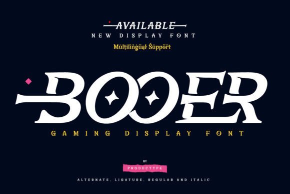
Booer Font: A Modern Display Typeface for Gaming-Inspired Web Design
As a UI designer who builds high-conversion landing pages, SaaS dashboards, and boutique e-commerce experiences, I look for display fonts that do more than just look bold — they need to reinforce tone, guide the eye, and hold up across devices. That’s why Booer stands out: it’s a sharp, modern display font built with digital clarity and gaming-era energy in mind — not as decoration, but as functional typography.
Booer isn’t a script or serif font. It’s a tightly spaced, geometric display typeface with aggressive angles, clean terminals, and strong visual weight. Its letterforms carry rhythm without sacrificing legibility — especially at larger sizes on screens. Think of it as the typographic equivalent of a responsive, low-latency UI: immediate impact, zero visual lag.
Where Booer Fits in Your Web Layouts
In practice, Booer excels where hierarchy and personality intersect. Use it for hero section headlines, product name tags, CTA buttons (in uppercase, 24–36px), and section headers that need to anchor attention — like “New Launch,” “Limited Drop,” or “Level Up Your Skills.” It works particularly well on dark backgrounds (with sufficient contrast) and over subtle gradients or blurred image overlays, thanks to its defined stroke contrast and open counters.
It’s less suited for body copy, long paragraphs, or small interface labels — not because it’s poorly designed, but because it’s intentionally expressive. Booer is a display font, not a workhorse sans serif. That distinction matters: using it where readability trumps flair can backfire. But used right — as a strategic accent — it strengthens your brand’s digital voice instantly.
Real-World Digital Use Cases
- Creative portfolios: Pair Booer with a neutral sans serif (like Inter or Manrope) for project titles over full-bleed visuals — it signals confidence without shouting.
- Gaming or tech SaaS landing pages: Apply Booer to feature headers (“Real-Time Analytics,” “Zero-Delay Sync”) to echo the speed and precision your product delivers.
- Boutique online stores: Use it sparingly on collection banners (“Summer Drop,” “Vault Edition”) — not on price tags or filters — to evoke exclusivity and energy.
- Digital course sales pages: Deploy Booer for module titles or outcome-driven headers (“Build Your First Game Engine,” “Ship in 7 Days”) — it subtly mirrors the ambition of your audience.
- Brand kits and digital assets: Booer scales cleanly into social media banners, email headers, and app splash screens when exported as WOFF2 for web use.
Readability & Responsiveness Notes
On mobile, Booer remains legible down to ~28px in hero contexts — but avoid sub-20px usage, even in bold weights. Test spacing: tracking adjustments (+20–40 units in CSS) improve breathability on tight lines. For dark mode interfaces, ensure your background luminance stays below 20% to maintain contrast ratio (aim for AA compliance at minimum). On light backgrounds, consider a subtle text shadow (1px black at 20% opacity) for added definition — especially over busy imagery.
Booer performs best with generous line-height (1.1–1.25) and minimal letter-spacing in all-caps usage. Avoid justified alignment — its geometry relies on natural word spacing to preserve rhythm.
Smart Font Pairing for Digital Projects
Booer thrives alongside highly legible, low-contrast sans serifs: Inter, Poppins, or IBM Plex Sans for body text and UI labels. Their neutrality lets Booer’s personality shine without competing. For editorial or premium brand sites, try pairing with a restrained serif like Lora or Playfair Display — but only for subheaders or pull quotes, never body copy. Never pair Booer with another display or decorative font; it dilutes focus and weakens hierarchy.
When building reusable design systems, treat Booer as a tier-one heading font (H1/H2), not a system-wide typeface. Define clear usage rules in your style guide: “Booer = Hero titles, campaign banners, key CTAs. Never in navigation, form fields, or data tables.” Consistency here builds trust — users learn to associate Booer with moments of importance.
Licensing & Technical Fit
Booer ships as a web-optimized font family — typically including WOFF2, WOFF, and TTF formats, with support for Latin-based languages. Check whether your license covers web embedding (critical for live sites), client projects, SaaS platforms, and digital templates. Most premium display fonts like Booer require an extended license for commercial use beyond personal projects — especially if your site processes transactions or hosts paid content. Verify multilingual coverage if your audience spans EU or LATAM markets.
It includes standard OpenType features — discretionary ligatures and stylistic alternates — but these are best reserved for static graphics (social posts, PDF pitch decks), not dynamic web text. For live sites, stick to the base weight set and leverage CSS font-weight for variation (e.g., 700 for headers, 800 for emphasis).
Why Booer Strengthens Your Digital Identity
In a landscape saturated with generic sans serifs, Booer offers tonal specificity. It doesn’t say “tech” — it says “cutting-edge, confident, fast-moving tech.” That nuance matters when users scan your site in under three seconds. Booer helps signal category alignment (gaming, creative tools, performance software) before a single sentence loads.
More importantly, it supports conversion-focused layouts by directing attention precisely: to your headline, your value prop, your primary button. When paired with intentional whitespace and aligned UI elements, Booer doesn’t distract — it clarifies. And clarity, in digital design, is the foundation of both usability and brand trust.
If your current display font feels safe but forgettable, Booer is worth testing in your next redesign. Not as a novelty, but as a deliberate tool — one that aligns visual language with user expectation, and aesthetic with action.